A SMART
INTERCOM
Our web studio was approached by a company engaged in the development of smart intercoms. This company needed a mobile version of the application for special, smart intercoms.
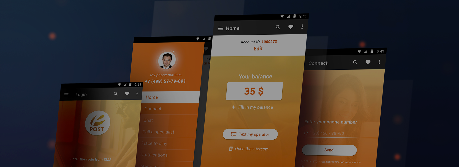
The basic colours of the app were orange and white. A mixture of red and yellow colours create a bright combination. In psychology, orange is associated with positive emotions and joy, while white is associated with minimalism and simplicity. This colour combination has a positive effect on the perception of the application and its contents.
Client
Post

USER-FRIENDLY
INTERFACE
The application has an easy-to-use interface that helps you to comfortably navigate through the pages of this mobile application. The interface has all the most important features that a potential client may need. Home page, chat with the operator, if there are any technical requests, call a specialist option, a payment place, as well as notifications.
The application has a function to connect to the intercom through a mobile phone and an important function of recharge. In case of problems with the intercom, the application allows you to call a specialist to repair it.