THE HOLDING
COMPANY
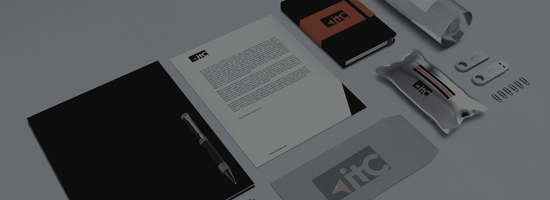
ITC is an international financial holding. As it is already known, the logo is the face and an important, integral part of the image of any enterprise. While creating the logo it was decided to use constructivism as the basis of the corporate identity. Minimalism at the heart of this logo allows a consumer not to be distracted by unnecessary details, which helps to better perceive the information that this company presents.
Client
ITC

THE COMBINATION OF
COLOURS
There is a detail in the form of a small insert - a yellow arrow. This colour was not chosen by accident, as in psychology it means joy, optimism, wealth and, in this case, the company's desire to grow up, develop and go towards their goals. The arrow directed upwards is a stylish, restrained postmodern detail.